" width="544.0252304077148px"><path d="M 120.038 0 C 186.333 0 240.076 53.743 240.076 120.038 C 240.076 186.333 186.333 240.076 120.038 240.076 C 53.743 240.076 0 186.333 0 120.038 C 0 53.743 53.743 0 120.038 0 Z" fill="rgb(1, 20, 24)" height="240.07569139998253px" id="yN8vm1Hrx" transform="translate(152 160)" width="240.0756913999826px"/><path d="M 0 20.006 C 0 8.957 8.957 0 20.006 0 L 20.006 0 C 31.055 0 40.013 8.957 40.013 20.006 L 40.013 60.019 C 40.013 71.068 31.055 80.025 20.006 80.025 L 20.006 80.025 C 8.957 80.025 0 71.068 0 60.019 Z" fill="rgb(1, 20, 24)" height="80.02523046666083px" id="shHSoeOt9" transform="translate(252 0)" width="40.01261523333051px"/><path d="M 0 20.006 C 0 8.957 8.957 0 20.006 0 L 20.006 0 C 31.055 0 40.013 8.957 40.013 20.006 L 40.013 60.019 C 40.013 71.068 31.055 80.025 20.006 80.025 L 20.006 80.025 C 8.957 80.025 0 71.068 0 60.019 Z" fill="rgb(1, 20, 24)" height="80.0252304666609px" id="f_wgo_K4w" transform="translate(252 480)" width="40.01261523333051px"/><path d="M 70.733 42.44 C 78.546 50.253 78.546 62.92 70.733 70.733 L 70.733 70.733 C 62.92 78.546 50.253 78.546 42.44 70.733 L 14.147 42.44 C 6.334 34.627 6.334 21.96 14.147 14.147 L 14.147 14.147 C 21.96 6.334 34.627 6.334 42.44 14.147 Z" fill="rgb(1, 20, 24)" height="84.87957469348834px" id="yd7tGmc9p" transform="translate(399.513 400.699)" width="84.87957469350249px"/><path d="M 70.733 42.44 C 78.546 50.253 78.546 62.92 70.733 70.733 L 70.733 70.733 C 62.92 78.546 50.253 78.546 42.44 70.733 L 14.147 42.44 C 6.334 34.627 6.334 21.96 14.147 14.147 L 14.147 14.147 C 21.96 6.334 34.627 6.334 42.44 14.147 Z" fill="rgb(1, 20, 24)" height="84.87957469348827px" id="L5H_XKlqs" transform="translate(60.412 75.598)" width="84.87957469350272px"/><path d="M 0 20.006 C 0 8.957 8.957 0 20.006 0 L 60.019 0 C 71.068 0 80.025 8.957 80.025 20.006 L 80.025 20.006 C 80.025 31.055 71.068 40.013 60.019 40.013 L 20.006 40.013 C 8.957 40.013 0 31.055 0 20.006 Z" fill="rgb(1, 20, 24)" height="40.01261523333062px" id="u2pqvCVt4" transform="translate(464 260) rotate(180 40.013 20.006)" width="80.02523046666101px"/><path d="M 0 20.006 C 0 8.957 8.957 0 20.006 0 L 60.019 0 C 71.068 0 80.025 8.957 80.025 20.006 L 80.025 20.006 C 80.025 31.055 71.068 40.013 60.019 40.013 L 20.006 40.013 C 8.957 40.013 0 31.055 0 20.006 Z" fill="rgb(1, 20, 24)" height="40.01261523333039px" id="aMBcd6Ugf" transform="translate(0 260) rotate(180 40.013 20.006)" width="80.02523046666079px"/><path d="M 42.44 14.147 C 50.253 6.334 62.92 6.334 70.733 14.147 L 70.733 14.147 C 78.546 21.96 78.546 34.627 70.733 42.44 L 42.44 70.733 C 34.627 78.546 21.96 78.546 14.147 70.733 L 14.147 70.733 C 6.334 62.92 6.334 50.253 14.147 42.44 Z" fill="rgb(1, 20, 24)" height="84.87957469348827px" id="e3VHiSnuY" transform="translate(392.513 75.598)" width="84.87957469350249px"/><path d="M 42.44 14.147 C 50.253 6.334 62.92 6.334 70.733 14.147 L 70.733 14.147 C 78.546 21.96 78.546 34.627 70.733 42.44 L 42.44 70.733 C 34.627 78.546 21.96 78.546 14.147 70.733 L 14.147 70.733 C 6.334 62.92 6.334 50.253 14.147 42.44 Z" fill="rgb(1, 20, 24)" height="84.87957469348834px" id="lsZHVEVAz" transform="translate(60.412 400.699)" width="84.87957469350272px"/></g></svg>)

Why does good design fail when it crosses culture?
E-commerce localization for the Japan market that achieved +4.71% CVR uplift.
Category
E-commerce
Dates
Dec 2024 - May 2025
Market
Japan
Role
Product Designer/ Researcher
1. Context
Wrong assumption
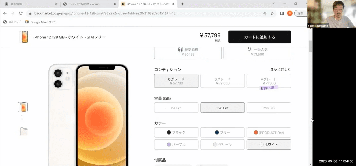
Back Market’s product page design worked well across Europe and the US. The design was clean, modern, conversion-optimized. But in Japan, conversion flatlined. Because "Good UX" meant something fundamentally different to Japanese consumers.
This case study will explain how our Japan team dismantled the assumptions baked into that page, rebuilt the purchase experience from cultural first principles, and proved it with a +4.71% conversion lift.
Screen recording of the global product page. The site design was modern and clean.
2. Discovery
Learn about our customers
To understanding "why" the site was not converting well, we needed to learn the friction between our expectation and what Japanese customers were feeling. To do that, I conducted a series of user researches.
From these researches, we gained some insights to base our hypothesis around the trust of Japanese customers.
3. Deep dive
Japanese design vs Western design
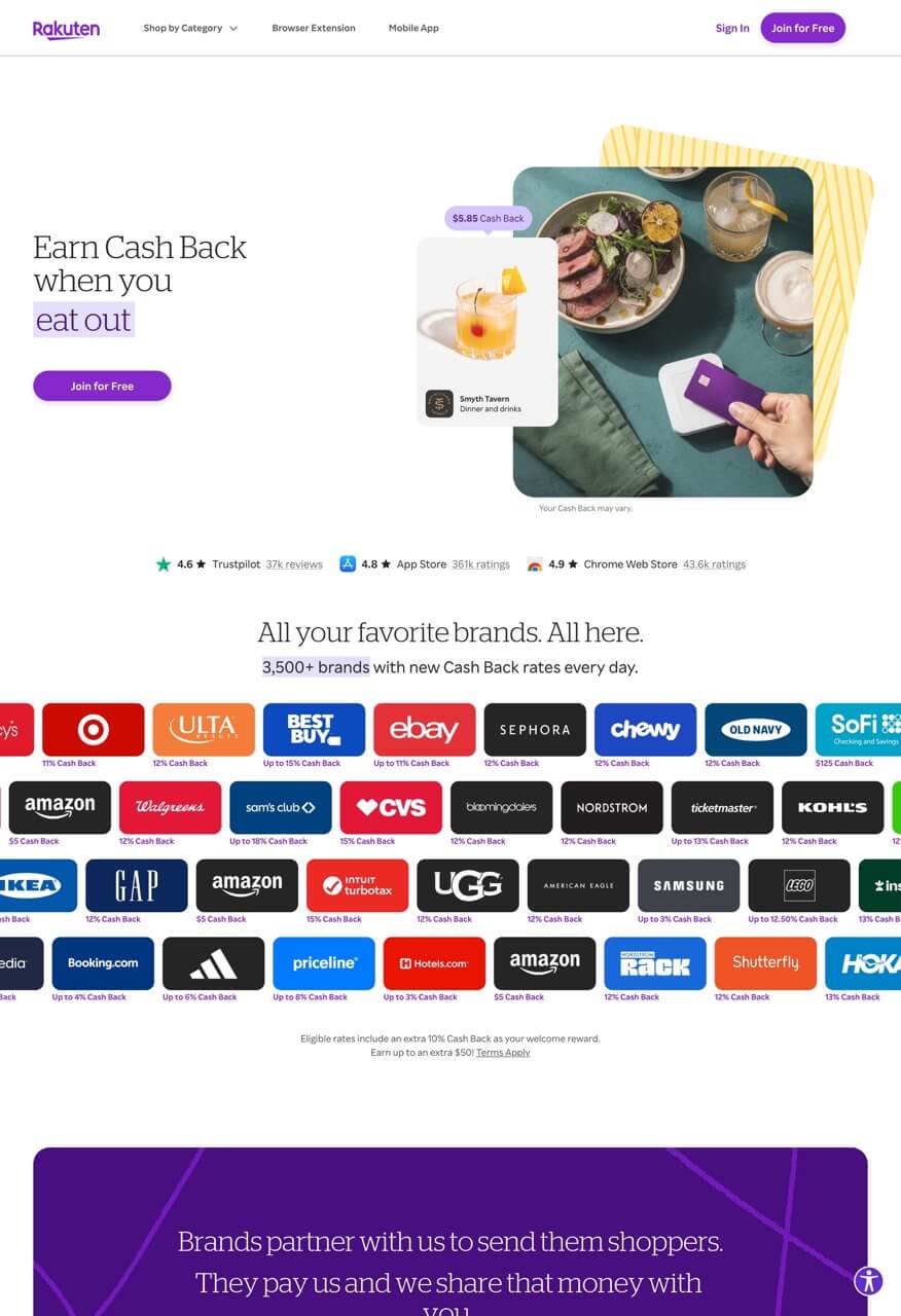
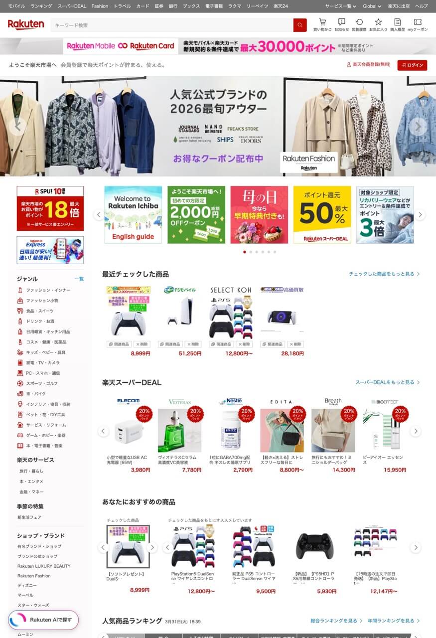
To further build our hypothesis, we needed to dive deeper to understand Japanese customers' expectations in online shopping. I started with competitor analysis, examining the top domestic e-commerce websites like Rakuten, Amazon Japan, and Yahoo shopping.

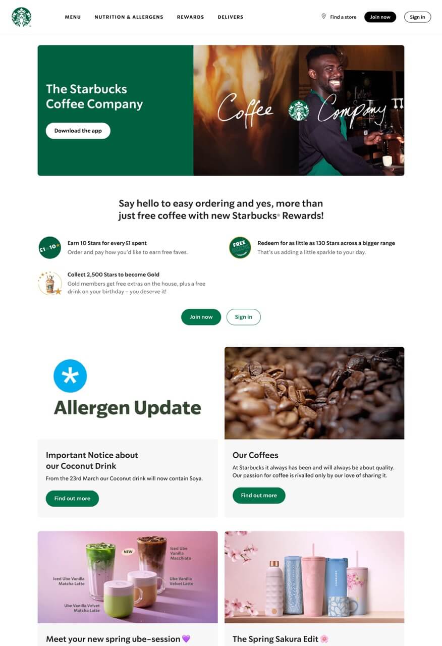
I also compared foreign brands' Japanese and the original website side-by-side, checking how their design approach differed.
Rakuten UK vs. Japan
Starbucks UK vs. Japan

Difference ①
Information density
You might have heard somewhere about the density of Japanese web designs. Yes — that is exactly what I will be sharing here. From the EC sites comparison, I learned how they display all the information upfront : specs laid out in full, reviews front and center, everything visible on one page. For brand sites as well, western versions breathes but Japanese versions cram more information in the same size of canvas.
Difference ②
Guided path vs. Self-navigation
One thing I noticed from the difference in the way they display information is how they guide users. In western design, negative space separates each element, a single call to action guides you forward, and the design assumes you'll follow the path it sets. It's a low-context page: one message, delivered clearly, trust the brand to show you what matters next. In Japanese design, there's no single path because the design isn't trying to guide you. It's trying to give you enough information to guide yourself. The negative space disappears because empty space isn't reassuring here — it's missing context.
This is likely an outcome of the difference between high-context and low-context culture. If you want to read more, I recommend reading this article by Edward T. Hall.

What's High/Low context information processing?
Edward T. Hall's high-context vs. low-context framework: high-context
4. Define
"Lack of trust" due to wrong cultural assumption
Based on the insights from the researches, We narrowed down our challenge to one main problem — "Lack of trust." Japanese customers didn't feel confident purchasing from the website because we didn't consider the cultural context. We applied a low-context experience model to a high-context market where consumers expect to see everything, evaluate holistically, and be given proof before they trust.
5. Design
"HMW reduce customer anxiety by meeting cultural expectations?"
Core experience
Core experience of the product page is configuration — customizing the selection of each item such as condition, color, storage.
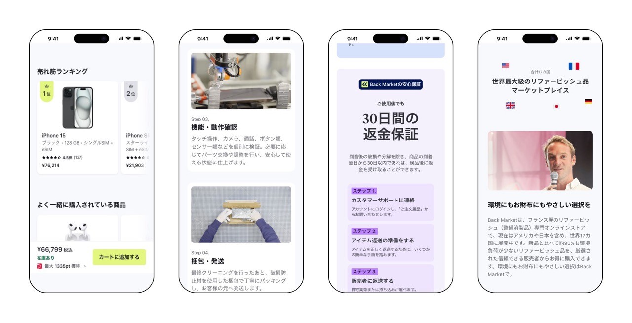
Global configuration guides users a step by step, making them focus on one selection per screen. However, this model is based on the low-context communication where services forces the path. In Japan version (image on the right below), we crammed 2 or 2.5 selections per scroll, using 2 by 2 grid. This lets users to view information with context, allowing them to configure holistically.


Top view
I made noticeable change to the landing view. Instead of the sustainability promotion, a verified refurbish tag to make it obvious that the device is refurbish to combat the challenge of low refurbish awareness in Japan. And noticeably, ATC button color is changed to Back Market's brand color, mindaro, from black. This idea was supported by the researches where we discovered that Japanese EC sites use brighter color for CTA (like orange/yellow of Amazon, red of Rakuten). Despite the low color contrast issue, we proceeded with this considering this was an experiment.
Funnel breakdown
Based on my insights from user research and competitive analysis, I had an hypothesis that most users scroll until they see reviews and drop after. Utilizing this information, I decide to put all the content I'd like users to see before the reviews section such as device condition guidance, battery information, and device specs.
Localized content
We added extra Japanese content such as rankings — common EC feature in Japan, refurbish process, warranty information, and about company . All in an effort to build trust of Japanese consumers.
Outcome
Results
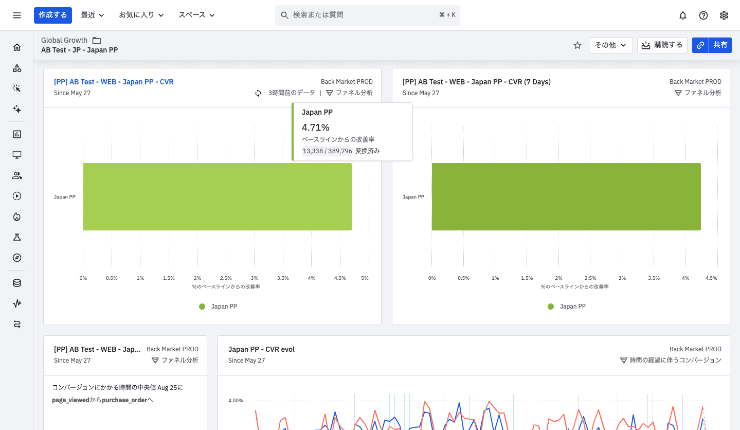
To measure the performance, we ran an A/B test with 50/50 traffic split for three months — enough time to reach sufficient volume in the Japanese market. The control was the existing production page: the global design with Japanese translation. The variant was the new localized page. The results below proved that the localization was a right approach.
・Total CVR = +4.71%
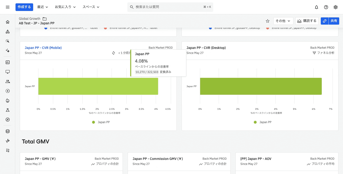
・Mobile CVR = +4.08%
・Desktop CVR - +6.45%